
Case study
A Mac app for Sankey diagrams, from first idea to the App Store in two weeks.




Swipe or scroll sideways to see all 8 slides. Click one to see it full size.
The project at a glance.
Role: Product designer and founder
Team: Solo, built with Claude Code
Timeline: August to October 2026
Why it needed to exist.
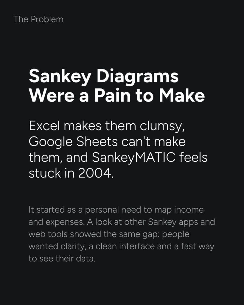
Sankey diagrams show where a total goes, like a budget splitting into rent, food and savings. Making one meant wrestling Excel, giving up on Google Sheets, or using a web tool that feels stuck in 2004. It started as a personal need, and other tools showed the same gap.
Make the product explain itself.
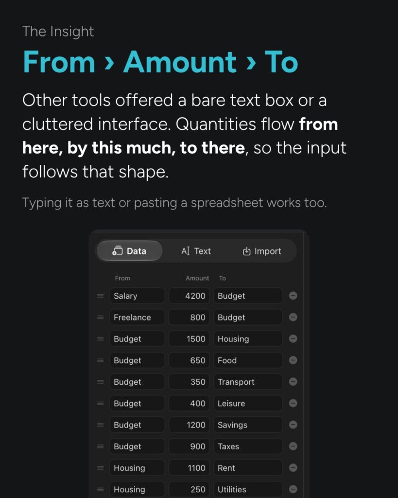
Money moves from here, by this much, to there. So the input works the same way: one row per flow, From › Amount › To. People who prefer typing or pasting a spreadsheet can still do that.
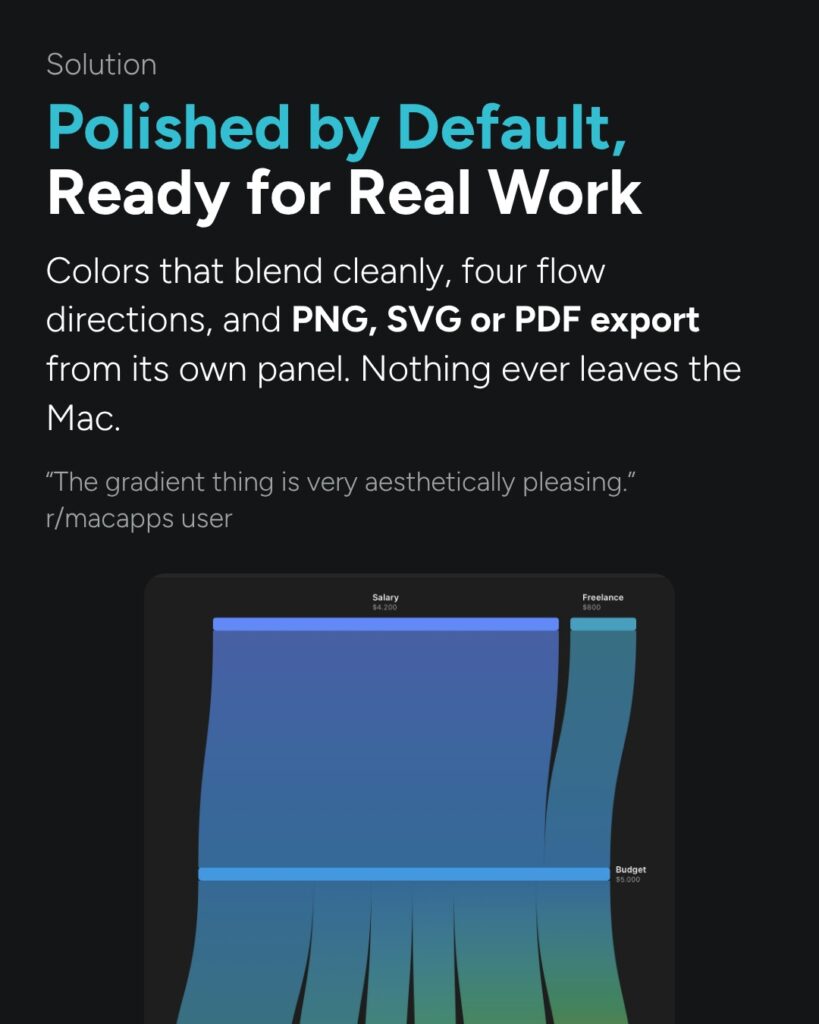
Polished by default.
Clean color blends, four flow directions, and export to PNG, SVG or PDF. Nothing leaves your Mac.
Shaped by users.
A month in, user requests drove version 1.1: a box for leftover amounts, version history and tabs.
How the launch went.
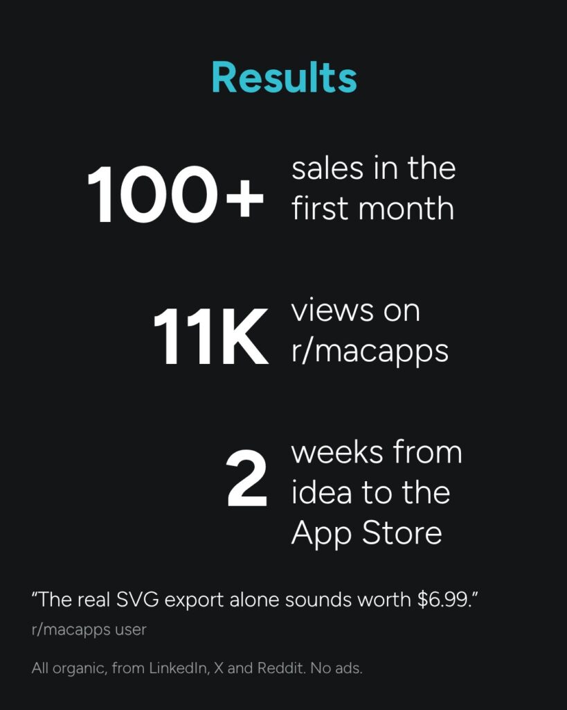
100+ sales in the first month
11K views on r/macapps
2 weeks from idea to the App Store
All organic. No ads.
“The real SVG export alone sounds worth $6.99.”
r/macapps user
30 minutes on video. No prep, no sales pitch.
Is your product story getting lost too? Let's look at it together.